
Font Types and How to Pair Them

For a designer just starting out, finding and pairing typefaces can seem like such a daunting task.
But, if you know what to search for, identifying fonts within any style will be easy and much less time consuming. If you're an Adobe Creative Cloud subscriber, you have access to Adobe Fonts which even allows the user to search fonts by type and size. Other great font resources include MyFonts (font purchasing), Typewolf (font info and reccommendations), along with various other free font distributing sites.Continue reading for descriptions of some of the most popular typeface styles as well as some tips on how to pair different styles most effectively.

Script + Sans Serif
The decorative and complex design of a script font pairs well with sans serif typefaces because of the contrast between detail (script) and simplicity (sans serif). The viewer's eye knows exactly where to look first because all the busy-ness of a script font steals the show right away. Then, the clean lines of a sans serif typeface give the eye a place to rest.

Sans Serif + Slab Serif
These two typeface styles pair very well because they share similar attributes, like their boxy shapes and blunt edges, but are different enough to be easily distinguishable to the eye. In this instance, the slab serif typeface adds some playful character to what might have been a more serious pairing with another font style.

Serif + Slab Serif
As noted above, serif typefaces tend to lean on the more serious side. In this case, we've paired it with a more curvy slab serif font that gives the serif font a more friendly and approachable feeling. Additionally, the thicker serifs on this serif font compliment the thick and blocky serifs on the slab serif style.
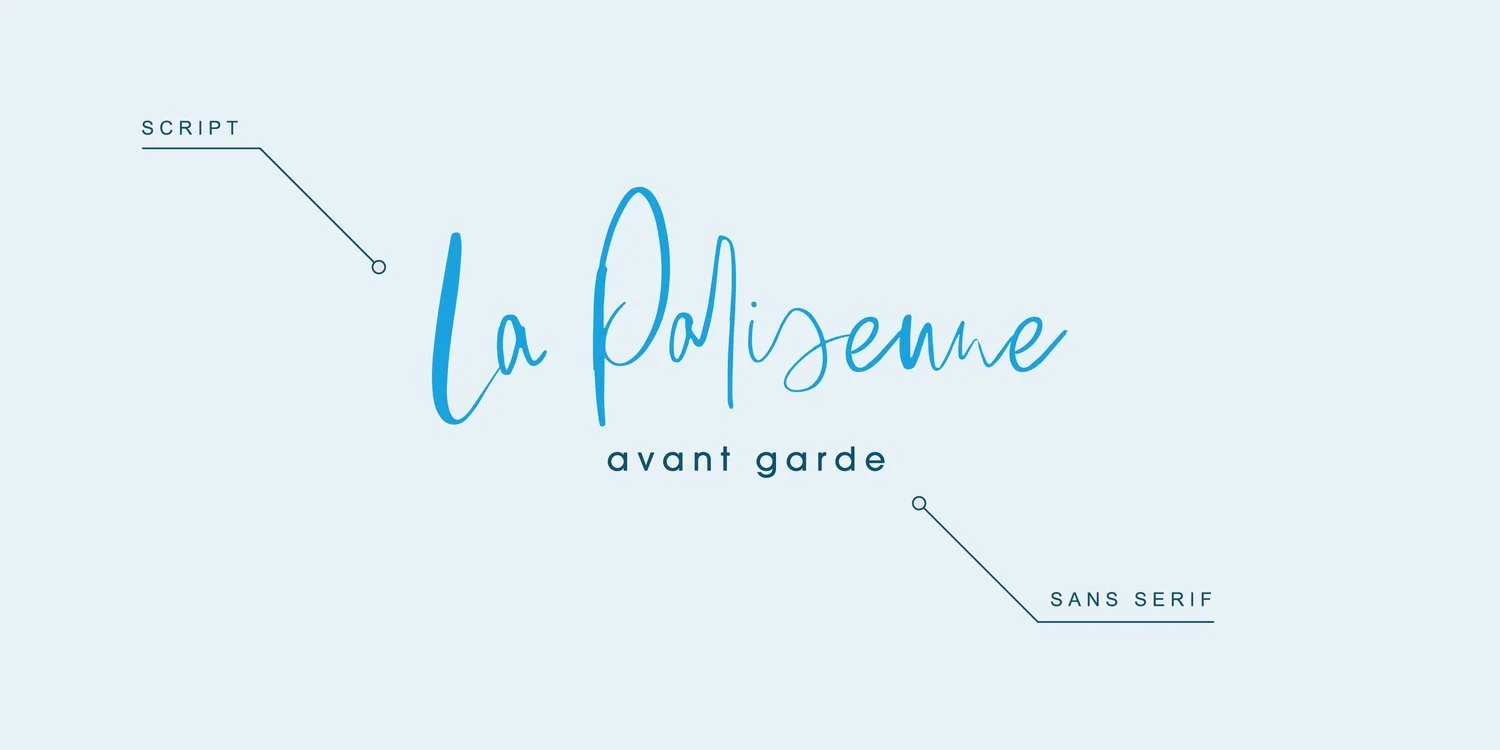
Script + Sans Serif
Unlike the script font above, this one is looks as if it were hand lettered. This makes it a candidate to be sub-categorized under the "script" category as a "handwritten" font type and using that word when searching for fonts will bring up a whole new selection of typefaces. Pairing this playful font style with a more rounded, sans serif typeface emphasizes the informality of the handwritten font and makes for an extremely approachable feeling.

Sans Serif + Sans Serif
Hereis a perfect example of the fact that no two fonts are alike! Even those within the same parent category can be drastically unique. While still a serif, Haboro has contrast within the letters giving it a completely different shape and texture than Proxima Nova. Another thing to note is x-height, which refers to the distance between the baseline of a line of type and tops of the main body of lower case letters (i.e. excluding ascenders or descenders). Haboro has a taller x-height in comparison to the letter widths than Proxima Nova, giving it a taller and slimmer look.