Security Solutions Area
OVERVIEW
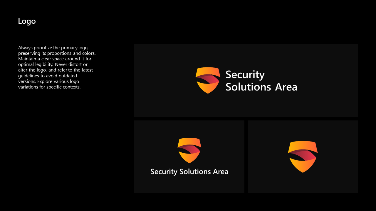
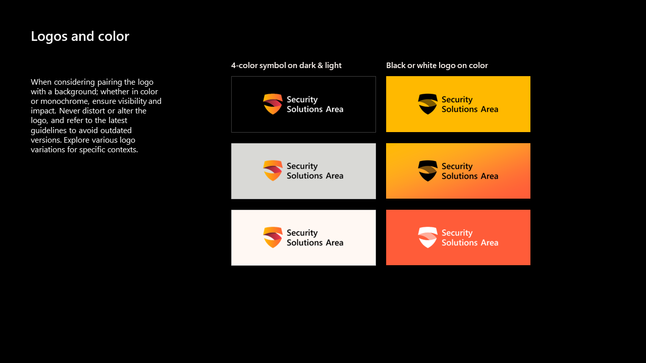
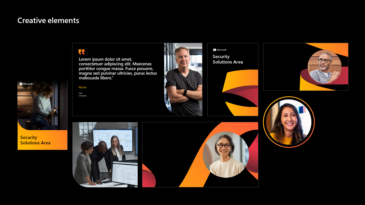
This visual identity project was in collaboration with the Microsoft Security Solutions Area, embodying their ethos as the good guys who fight cybercrimes and ensure users' safety and security, aiming to be with them forever. At the core of the branding concept lies the vision of security heroes. The logomark is inspired by the superhero cape movement, the letter S, and a shield symbolizing resilience and safeguarding, while vibrant orange hues signify energy, optimism, and a proactive approach to security. Staying true to their brand essence, we crafted captivating visual assets that exemplify their commitment to safeguarding users and inspiring trust in their security solutions.
PROJECT SCOPE
Brand Strategy
Email Templates
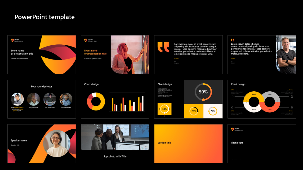
PowerPoint Template
Social Media Template
Video Bumpers
Virtual Backgrounds
Visual Identity
Web Banners