10 Logo Rebrands: What Do They Have in Common?
What does a logo say about a company? Maybe it tells a story about strength, friendliness, power, or trust.
The colors, imagery, and typographic style in a logo mark convey a brand’s personality and send a message to the world. A logo shouts “This is who we are!” from the rooftops and is usually the first impression the consumer will get from a business.
So what story does a logo tell, and what happens when they all start looking the same?
Flat logo design is, and has been, a continuing trend for almost a decade now. Because of that, many companies have had the opportunity to catch on and re-design their brand. Apple was one of the leading trendsetters of this in 2013 when iOS and MacOS transitioned away from their signature glossy and cartoon-ish looking app icons and buttons. Anyone remember that old Safari icon? What a throwback.
Alongside this shift to flat logo design we also started seeing similar typographic treatments between logos.
If you continue through the examples below, you’re likely to notice a similarity in the type of the updated logos (right side) which, across all the brands, mostly use sans-serif, Helvetica-like fonts that have consistent strokes and symmetry throughout the letters (no tapering). In most of these examples, the letters are not too wide and not too tall with neutral x-heights compared to their letter widths.
What stories are the logos in this article telling us?
They may have lots in common, but their differences just might be enough to tell a unique and personal tale every time.

Airbnb unveiled their current logo in 2014.
Image from Entrepreneur.com
While they were one of the earlier companies to jump on the bandwagon of the flattened logo trend, this vacation rental hub got creative with the icon that has become a recognizable and well-loved symbol of the brand. Humans love a story, and Airbnb’s creative expression of their brand’s values is one that is hard not to fall in love with.

Instagram’s nostalgic and iconic original logo gives most social-media-addicted millennials “all the feels” (as a true twenty-something would put it).
Its outdated yet warm and comforting nod to the Polaroid camera is as awe-inspiring as waiting for your photo to develop after being printed. Alas, Instagram’s personality and user experience changed so their logo needed to as well.
The company’s current logo, released in the spring of 2016, was controversial at the time, but now appears as a well-loved symbol of the brand’s focus on a simplified and refreshing UX. And most social media users would agree, the little rainbow square on their phone’s home screen is more addicting now than ever before.

In 2014 Olive Garden made a drastic change to their logo for the first time since the restaurant opened in 1982.
There were a few revisions along the way, but aside from adding the grapevines in the top corner in 1998 (left) the logo stayed virtually the same for almost 32 years.
While the updated version is cleaner, more legible, and generally an easier-to-look-at design, many agree this flattened logo lacks the rustic personality that is so heavily associated with the brand.

BMW followed the trend and rebranded with a flat logo as well.
Image from Forbes.com
The last variation of the elite car company’s logo was created in 1997. This new 2020 version is the 9th logo variation in BMW’s history, and by far the most radical change we’ve seen yet.
BMW also shared a mock-up of what their new logo would look like on a vehicle. Seeing the logo digitally is pretty underwhelming, but the treatment on the car is much more sleek than the chunkier 1997 version.

Volkswagen and Nissan joined the trend and flattened their logos in 2019 (VW) and 2020 (Nissan). While these logos are definitely more streamlined and are easier to read than their predecessors, they are possibly too plain, especially in digital form. We love seeing that Nissan kept some of their individuality with the more stylized logotype font and tapered edges on the circle that help it feel more luxurious.

Although Tripadvisor’s previous logo is already quite flat and falls along the general guidelines of the current trend,
the travel company pushed it even further in January of 2020 with the debut of their latest logo variation. This minimal, two-color design is a breath of fresh air for the company that was already ahead of the game.


Uber and Firefox are more examples of companies that moved to a more flat and trendy logotype in recent years.
Uber rebranded in 2018 (after their 2016 rebrand that was widely unpopular) and - surprise! - their logotype looks a lot more like the other examples in this post. However, the simplicity of their logo history, down to the black and white color palette, does seem to continue to tell the story of a luxurious, white glove ride share service.
In 2019 Firefox unveiled their new logo using a similar type treatment to the others in this article. But, when it’s shown alongside their iconic sweeping fox tail icon, it’s clear that the company did a great job maintaining their uniqueness while transitioning to a more modern look. This is an excellent example of how a flattened logo can still hold lots of depth.

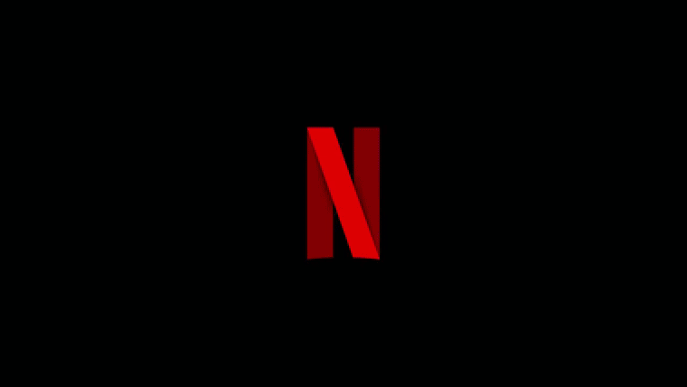
Lastly, Netflix’s 2015 rebrand slid under the radar a bit more because the colors and general shape of the logo stayed the same.
However, they too transitioned to a flatter style. It was an interesting move for the production company in 2019 when they released a new icon animation that has much more depth and colors than the flat logos we’ve been seeing lately.
This push towards flattened logos works in many cases, but it’s clear that brands are slowly becoming more and more alike in their logo styles.
With the prevalence of social media and sites like Dribble, inspiration of current design trends around the world has never been easier to obtain. And while manay of the characteristics of a flat logo are appealing, a brand’s ability to distinguish themselves is more important than ever. Iconography, color, letter shapes, and typographic styles will all play a part in this and, here at ZUM, we’re so excited to see how companies tackle this challenge this in the coming years.